
Six Support Email Metrics Managers Must Track to Spot Churn Early
Six Support Email Metrics Managers Must Track to Spot Churn Early ! Support manager reviewing shared inbox metrics Track six numbers first: SLA compliance rate, first response time, resolution time, CSAT, repeat contact rate, and sentiment.

Track six numbers first: SLA compliance rate, first response time, resolution time, CSAT, repeat contact rate, and sentiment. These matter because they cover speed, outcome quality, and early risk in one glance. A working dashboard needs five tiles: SLA compliance up top, then first response time, resolution time, and CSAT in the middle row, with workload and sentiment underneath.
TL;DR:
- Tracking both average and median resolution times helps identify outliers that distort overall performance and customer experience.
- SLA compliance rates should be broken down by priority tier to reveal hidden issues in high-priority queues.
- Advanced early warnings like ticket velocity, repeat contact rate, and sentiment trend indicators can predict customer churn before satisfaction scores decline.
- A simple, focused dashboard with five key metrics checked weekly enables faster decision-making and better workload management.
- Using shared inboxes with proper attribution and real-time API integration is critical for accurate measurement and actionable insights in email support.
Table of Contents
- Core Email Support Metrics: What Each One Measures And Why It Matters
- Advanced Metrics That Predict Churn And Account Risk
- Build A Compact Weekly Email Metrics Report And Dashboard
- How To Measure Each Metric Accurately: Formulas And Common Pitfalls
- Tools And Integration Approaches For Measuring Email Metrics
- How Sendsync Supports Faster, Measurable Email Support
- Practical Checklist: Roll Out These Metrics In The First 90 Days
- Sendsync: Quick-Start Shared Inbox For Measuring And Improving Email Support
- Sources
- FAQ
Core Email Support Metrics: What Each One Measures And Why It Matters
Most support teams track too many numbers and act on none of them. The fix isn’t adding more spreadsheets. It’s picking the metrics that actually predict whether a customer stays happy, or leaves.
First response time (FRT) measures how long a customer waits between sending an email and getting a human reply. The formula is simple: total time from receipt to first reply, averaged or (better) taken as a median across a given period. FRT is the one metric customers feel most acutely, even before resolution happens, because silence reads as neglect. A common measurement mistake is counting auto-replies as first responses; these should be excluded because customers distinguish them from actual answers. They aren’t. Customers know the difference between “we got your email” and an actual answer.
Average and median resolution time (ART) tracks how long a ticket stays open from first contact to close. Calculate it as total resolution time divided by number of resolved tickets for the average, or find the middle value in a sorted list for the median. Median matters more than most teams realize. If nine tickets close in under an hour and one drags on for three days because of a billing escalation, the average tells you resolution takes hours longer than it actually does for most customers. The median shows what a typical customer experiences; the average shows where your total workload capacity goes. Track both, and read the gap between them as a signal of how many outlier tickets are distorting your numbers.
SLA compliance rate is the percentage of tickets resolved, or first responded to, within an agreed time window. The formula for SLA compliance is tickets meeting SLA divided by total tickets, multiplied by 100 to express as a percentage. This number should never be reported as one flat figure. Break it down by priority tier, because a 95% SLA compliance rate across all tickets can hide a 60% compliance rate on your highest priority queue if low priority tickets dominate the volume. Gartner’s SLA framework recommends defining separate targets per tier rather than one blanket threshold, precisely because urgency and expectation differ by ticket type.
CSAT, CES, and NPS measure different things and shouldn’t be used interchangeably. CSAT (Customer Satisfaction Score) asks how satisfied a customer was with a specific interaction, usually on a 1 to 5 scale, sent immediately after ticket close so the memory is fresh. CES (Customer Effort Score) asks how much effort it took to get an answer, which correlates more directly with repeat contact than CSAT does. NPS (Net Promoter Score) asks about overall loyalty to the brand and should be surveyed quarterly, not per ticket, since it measures relationship health rather than a single email exchange. Salesforce’s KPI framework treats these three as complementary layers: CES flags friction, CSAT flags interaction quality, and NPS flags long-term risk.
First contact resolution (FCR) and repeat contact rate are two sides of the same coin. FCR is the percentage of tickets solved in a single exchange, no back-and-forth required. Repeat contact rate is the percentage of customers who email again about the same issue within a set window, commonly seven days. FCR predicts satisfaction better than almost any other metric, because customers rank “having to explain myself twice” among their biggest complaints. A support inbox with high FRT but low FCR is optimizing for the wrong thing: fast, incomplete answers that generate more email.
Unreplied email rate and backlog catch the emails that fall through the cracks entirely, not the slow ones, the missing ones. This shows up when tickets sit unassigned in a shared mailbox or when a customer’s reply lands in a thread nobody’s watching. A rising backlog number, tickets open longer than 48 or 72 hours, is often the first sign that staffing hasn’t kept pace with volume. Teams using a shared inbox designed to prevent missed messages tend to catch this leakage earlier because unassigned threads are visible by design rather than buried in a personal inbox.
Volume per agent and workload distribution tell you whether your team’s capacity is being used fairly. Track this weekly, not monthly, because workload imbalances compound fast.
Average handle time (AHT) measures the total time an agent spends actively working a ticket, including research and drafting, not just the clock between messages. Read it alongside CSAT, never alone. A dropping AHT paired with dropping CSAT usually means agents are cutting corners to hit a speed target, and that tradeoff will show up in repeat contacts within weeks.
Quick reference for the core set:
- FRT = time to first human reply (track median, not just average)
- ART = time to resolution (track both average and median)
- SLA compliance = (tickets within SLA ÷ total tickets) × 100, segmented by tier
- FCR = (tickets resolved on first contact ÷ total tickets) × 100
- Repeat contact rate = (tickets reopened within 7 days ÷ total resolved) × 100
- AHT = total active work time ÷ tickets handled
Advanced Metrics That Predict Churn And Account Risk
By the time CSAT drops or an account cancels, you’ve already lost the window to fix it. The metrics that catch risk early aren’t satisfaction surveys. They’re behavioral: how fast someone’s email volume changes, how often they come back with the same problem, and how their tone shifts across a conversation.
Ticket velocity per account tracks how many emails a specific account sends over a rolling period, compared to that account’s own historical baseline. A customer who normally sends two emails a month and suddenly sends eight in a week isn’t just busier. Something broke, or they’re losing patience and escalating internally before they escalate to you. The useful comparison isn’t against other accounts. It’s against that account’s own 90-day median.

Repeat contact rate, at the account level rather than the ticket level, is one of the clearest predictors of dissatisfaction. A working threshold is to flag any account with multiple repeat contacts on the same issue within a short timeframe, such as about a week. That’s not a coincidence pattern, it’s a signal the first resolution didn’t actually resolve anything.
Sentiment shift index compares the emotional tone of a customer’s opening message against their closing message in the same thread. Score sentiment at the start and end of a conversation (many analytics tools do this automatically using language-model scoring), then look at the direction of change, not just the absolute score. A ticket that opens neutral and closes frustrated is a worse outcome than one that opens angry and closes neutral, even if the final sentiment score looks similar on paper. Direction matters more than the raw number.
Here’s how to put these three signals to work in sequence:
- Flag any account whose ticket velocity has roughly doubled against its own historical median.
- Cross-check flagged accounts against repeat contact rate. Two or more reopens within a week moves the account to a priority review list.
- Layer in sentiment shift. An account with rising velocity, high repeat contacts, and a negative sentiment trend across recent threads should trigger account-level outreach, not another auto-reply.
- Correlate the combined signal against CSAT and NPS history for that account. If leading indicators are red but lagging scores still look fine, you’re catching the problem before it shows up in a survey. That’s the entire point.
Repeat contact rate and ticket velocity rank among the strongest predictors of churn in email-based support, well ahead of any single satisfaction score taken in isolation. The logic holds up under scrutiny: satisfaction surveys measure how someone felt about one interaction, while velocity and repeat contacts measure a pattern across many. Patterns move first.
Teams that lean only on CSAT and NPS are, in effect, driving by looking in the rearview mirror. Those scores tell you what already happened. Velocity, repeat contacts, and sentiment direction tell you what’s happening right now, while there’s still time to act. If ticket volume for a key account spikes suddenly, a structured escalation playbook for surging demand can help you decide whether to reassign staff or bring in temporary coverage before backlog builds.
Build A Compact Weekly Email Metrics Report And Dashboard
A dashboard with twenty metrics gets ignored. A dashboard with five gets checked every morning. The difference isn’t sophistication, it’s restraint.
Structure the dashboard in three tiers:
- Top tile (headline): SLA compliance rate, the single number leadership should glance at first. A focused headline metric drives faster decisions than a wall of secondary numbers, because it forces a yes/no read on whether the team is meeting its commitments.
- Middle row (the core trio): first response time, resolution time (median, not just average), and CSAT. These three together answer “are we fast, are we effective, and are customers actually happy.”
- Lower row (diagnostic): workload distribution per agent, sentiment trend, and repeat contact rate. This row is where you catch the problems the top two rows haven’t surfaced yet.
Cadence matters as much as layout. Send the full five-tile dashboard to support managers weekly, on a fixed day so trends are comparable week over week. Ops leads need a daily snapshot instead, mainly SLA near-breaches and backlog count, since those change hour to hour. Executives get a weekly summary that leads with SLA compliance and lists the top three at-risk accounts by name, not a full metrics dump.
Alert rules turn a passive dashboard into something people actually act on. None of these require guesswork, they’re pattern comparisons against a account’s own history, which is more reliable than a fixed threshold applied to everyone equally.
Pro Tip: Don’t build the dashboard around what’s easy to pull from your system. Build it around the three questions leadership actually asks in a review meeting: are we hitting our commitments, is anyone about to churn, and is the team overloaded. Every tile should answer one of those.
Real-time visibility into inbox status makes near-breach alerts meaningful in practice, not just on paper, because a manager can actually reassign a ticket before the SLA window closes rather than finding out after the fact.
How To Measure Each Metric Accurately: Formulas And Common Pitfalls
Getting the formula wrong is more common than most teams admit, and it usually happens quietly, through inconsistent timestamp handling or unclear ownership rules in a shared inbox.
Here are the exact formulas, with worked numbers:
| Metric | Formula | Worked example |
|---|---|---|
| First response time (FRT) | Time of first human reply minus time of receipt | Received 9:00 AM, replied 11:30 AM → FRT = 2.5 hours |
| Resolution time (ART) | Time of resolution minus time of receipt | Opened Monday 9:00 AM, closed Wednesday 9:00 AM → ART = 48 hours |
| SLA compliance rate | (Tickets within SLA ÷ total tickets) × 100 | 92 of 100 tickets met a 4-hour SLA → 92% compliance |
| Repeat contact rate | (Tickets reopened within 7 days ÷ total resolved) × 100 | 6 reopens out of 120 resolved → 5% repeat contact rate |
| Sentiment shift index | Closing sentiment score minus opening sentiment score | Opens at −0.4, closes at +0.1 → shift of +0.5 (positive resolution) |
The average versus median distinction isn’t academic; it changes what decision you make. Say ten tickets have these resolution times in hours: 1, 1, 2, 2, 2, 3, 3, 4, 5, 40. The average is 6.3 hours, dragged up almost entirely by that one 40-hour outlier. The median is 2.5 hours, a far more honest picture of what a typical customer experiences. If you staff based on the average, you’ll over-resource for a rare edge case. If you report only the median to leadership, you’ll hide the fact that one ticket type is badly broken. Report both, every time.
Attribution gets messy fast in shared mailboxes, where multiple agents can touch one thread. The cleanest rule: use the first human reply, from anyone on the team, as the FRT anchor, regardless of who eventually owns the ticket. For resolution attribution, use the timestamp of whoever closes the ticket, not whoever first replied, since ownership often transfers mid-conversation. Document this rule explicitly in your measurement spec. Without it, tickets that pass between two or three agents get double counted in individual performance numbers, which quietly corrupts your workload distribution data. Time zone handling matters too: normalize every timestamp to one reporting time zone before calculating FRT or ART, or a ticket answered “fast” at 11:00 PM in one region will look slow in another.
Tools And Integration Approaches For Measuring Email Metrics
Three categories of tools capture email metrics, and picking the wrong one for your team size wastes months.
Email analytics platforms sit on top of your existing inbox and calculate response times, SLA alerts, and sentiment scores without changing how agents work day to day. Products in this category read conversation signals directly and surface at-risk threads automatically, which works well for teams that don’t want to change their existing email habits but do want visibility into performance.
Shared inboxes solve a different problem: attribution and workflow, not just measurement. When multiple agents work from one mailbox, a properly structured shared inbox makes ownership and assignment explicit, which is what makes accurate FRT and resolution attribution possible in the first place. Analytics on top of a chaotic inbox just measures the chaos more precisely.
Ticketing and reporting systems make sense once volume and complexity justify structured workflows, custom fields, and multi-step approval chains. For a lean support team handling most of its volume through email, a full ticketing system can be more overhead than the problem requires.
A few integration notes worth acting on before you commit to any tool:
- Confirm the tool supports API backfills so you’re not starting your metrics history from zero on launch day.
- Set connector sync cadence to real time or near real time for SLA alerts; anything on a delay defeats the purpose of a near-breach warning.
- Check data-retention policies before connecting a mailbox, especially for regulated industries handling customer PII in email threads.
- Confirm Gmail and Microsoft 365 both connect natively rather than through a workaround, since most support teams run on one of the two.
How Sendsync Supports Faster, Measurable Email Support
Most of the metrics above depend on one thing happening first: clean, attributable data from a mailbox that isn’t a mess. Sendsync connects Gmail and Microsoft 365 mailboxes directly, without the DNS configuration that normally stretches a help desk setup into days or weeks. That speed matters for measurement specifically, because you can’t calculate a baseline FRT or SLA compliance rate until the team’s actually working inside a system you can measure.
Collaborative assignment inside a shared inbox is what makes workload distribution and FRT attribution accurate in the first place. When every reply, assignment, and internal note happens inside one visible workflow, the ownership ambiguity that corrupts resolution-time data mostly disappears.
Unlimited-user pricing with no per-seat fee removes a common barrier to comprehensive measurement, since teams with limited seats often have some agents working outside the monitored system, leaving data gaps.
Practical Checklist: Roll Out These Metrics In The First 90 Days
Start small. Week one: baseline your first response time using whatever data you already have, and set a first-draft SLA target by priority tier. Don’t try to hit a benchmark on day one, just get the number.
Month one: layer in SLA compliance tracking, start monitoring backlog daily, and fix any obvious workload imbalance between agents before it becomes a retention problem for your own staff.
Quarter one: add sentiment tracking, repeat contact rate, and ticket velocity per account. Once those three are running, begin proactive outreach to any account flagged by the combined signal, before its CSAT or NPS ever drops.
— Nick
Sendsync: Quick-Start Shared Inbox For Measuring And Improving Email Support
A shared inbox solution can enable your team to start measuring within minutes of connecting a mailbox, without DNS setup delays. Connect common email services, assign conversations collaboratively, and start tracking key metrics like first response time and SLA compliance quickly.
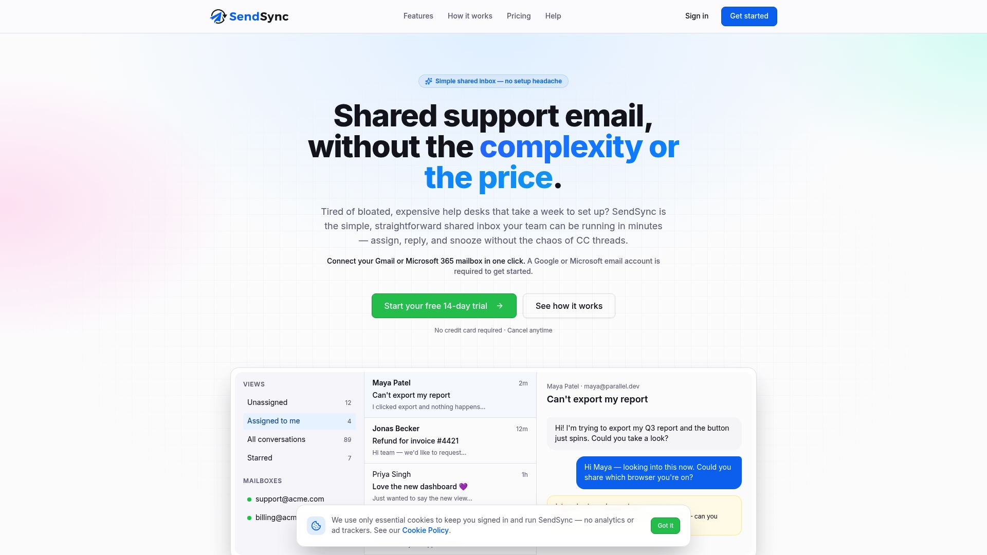
Pricing without per-seat fees means the whole team can be included from day one, not just a limited subset of agents. That’s the difference between a dashboard that reflects your actual support operation and one that reflects whichever slice of it you could afford to monitor. If backlog, uneven workload, or missed emails are the problem you’re trying to solve, start a free trial at Sendsync and see your first week of real FRT and SLA numbers before you commit to anything.
FAQ
What Are Good Email Metrics To Track?
The strongest set covers speed, outcome, and risk: first response time, resolution time, SLA compliance rate, CSAT, repeat contact rate, and sentiment. Together they answer whether you’re fast, effective, and catching problems before they become churn.
What Are Examples Of Customer Service Metrics?
Common examples include first response time, average resolution time, first contact resolution, CSAT, CES, NPS, and ticket volume per agent. Salesforce’s KPI framework groups these into speed, quality, and operational health categories.
What Are Email Performance Metrics?
Email performance metrics measure how fast and effectively a support team handles email specifically: first response time, resolution time, SLA compliance by tier, unreplied email rate, and backlog size. A shared inbox like Sendsync makes several of these easier to attribute accurately since ownership and assignment stay visible.
What Are Five Examples Of Metrics To Measure Performance?
Five that cover the full picture: first response time, resolution time (tracked as both median and average), SLA compliance rate, CSAT, and repeat contact rate. Add ticket velocity and sentiment shift once the core five are running reliably.
Should I Track Average Or Median Response Time?
Track both. The median shows what a typical customer experiences, while the average reveals how much total capacity outlier tickets are consuming, and the gap between the two numbers is itself a useful signal.