
Support Managers: Turn Workload Reports Into Fixes From Days to Hours
Support Managers: Turn Workload Reports Into Fixes From Days to Hours ! Manager reviewing support workload heatmap A workload report tells you exactly where demand is outrunning capacity, whether that's a specific hour, a specific agent, or a specific ticket type, so you can fix

A workload report tells you exactly where demand is outrunning capacity, whether that’s a specific hour, a specific agent, or a specific ticket type, so you can fix it before it shows up in your SLA numbers. Managers who check reports weekly, and a rolling 4-week trend, catch imbalance while it’s still cheap to correct. This guide walks through the metrics that matter, where to pull the data, and exactly how to turn a chart into a staffing or scheduling decision.
TL;DR:
- High occupancy levels during peak hours, especially from 10 a.m. to noon on weekdays, indicate overloaded queues requiring immediate reallocation.
- Pairing ticket volume with average handle time and SLA compliance reveals whether demand truly outpaces capacity or if inefficiencies exist.
- Relying solely on team-wide averages can hide significant imbalances between agents or skill groups that need targeted adjustments.
- Weekly workload reports and real-time inbox visibility enable quick fixes like shift swaps or rerouting tickets to prevent SLA breaches.
- Pulling at least four weeks of detailed, interval-based data ensures accurate analysis and avoids reacting to noise or short-term fluctuations.
Table of Contents
- What Does a Workload Report for Support Show?
- Which Metrics Actually Matter for Support Workload Analysis?
- Where Should the Data Come From?
- How Do You Analyze a Workload Report Step by Step?
- How Do You Turn Findings Into Action?
- How Do You Read a Heatmap and Occupancy Chart in Practice?
- Perspective: Measurement Mistakes Managers Make and How to Avoid Them
- Close the Loop Faster With SendSync
- Sources
- FAQ
What Does a Workload Report for Support Show?
A solid workload report combines a few core visualizations, each answering a different question. Key metrics cards give you the headline numbers at a glance: open volume, average handle time, SLA compliance. A workload-over-time graph shows whether ticket volume is climbing, flat, or seasonal. A busiest-times heatmap maps volume against hour and day, so you know exactly when you’re understaffed. Efficiency or occupancy charts show how much of an agent’s logged time is spent actually working tickets versus idle. A workload-by-inbox or queue table breaks volume down by channel or team, which is where hidden imbalance usually hides.
Vendor tools structure their workload reports around exactly these sections. Expect standard controls too: date-range filters, saved views, and export to CSV or PDF for anyone who needs the numbers outside the dashboard.
Which Metrics Actually Matter for Support Workload Analysis?
Volume alone tells you almost nothing. The real signal comes from pairing metrics against each other.
| Metric | What it measures | Why it matters |
|---|---|---|
| Ticket volume | Tickets or calls received per interval | Baseline demand; feeds every other calculation |
| AHT (average handle time) | Time spent per ticket, by type | Reveals which ticket categories eat the most capacity |
| Occupancy/utilization | Percent of logged time spent working tickets | High occupancy with no volume increase signals under-staffing |
| SLA compliance | Percent of tickets resolved within target time | Direct measure of whether capacity is keeping pace with demand |
| FCR (first contact resolution) | Percent resolved without follow-up | Low FCR inflates volume with repeat contacts |
| Backlog age | How long unresolved tickets have been open | Growing backlog age is often the earliest warning sign |
| CSAT | Customer satisfaction score | Confirms whether speed gains are costing quality |
The pairings matter more than any single number. High occupancy paired with a dropping CSAT usually means agents are rushing to clear volume at the expense of quality, not actually working faster. A good rule of thumb, backed by common workload analysis guidance: never trust a blended average across ticket types, because it hides exactly the complexity you’re trying to find.
Where Should the Data Come From?
Your report is only as good as its inputs, and pulling from a single source almost always understates the real picture.
- Ticketing/ACD system: volume by interval, channel, and ticket type
- CRM: customer history and context that explains complexity spikes
- QA platform: quality scores tied to specific agents or ticket categories
- Time-tracking/WFM tool: logged hours, occupancy, and schedule adherence
- Schedule/payroll data: actual staffing levels against planned shifts
Pull a minimum of four weeks of data before drawing conclusions. Anything shorter and you’re reacting to noise, not a pattern, a point echoed in workload analysis research on call center staffing. Aggregate at 30-minute or hourly intervals, not daily, since daily totals smooth out the exact peaks you need to see. Before analyzing anything, strip out bot-generated tickets, account for after-call work (ACW) time that inflates handle time numbers, and unify multi-channel volume so email, chat, and phone don’t get analyzed as separate universes.
Pro Tip: If your ticketing tool and your time-tracking tool disagree on total hours worked, trust the time-tracking data for occupancy math and the ticketing data for volume. Mixing sources for the same metric is how false alarms get triggered.
How Do You Analyze a Workload Report Step by Step?
Run the same five-step sequence every time you review a report, and you’ll catch problems in the same order they actually cause damage.
- Validate inputs and set a baseline. Pull four weeks of clean data before you look at a single chart.
- Check interval-level peaks. Scan the heatmap for hours where occupancy climbs past a workable threshold. Many teams flag high occupancy levels as signs of overload and low occupancy levels as signs of slack capacity worth reallocating.
- Check team-level occupancy against skills. A team can look fine on average while one skill group drowns and another sits idle.
- Break down call-type or ticket-type complexity. Cross AHT and FCR by category to find which ticket types are quietly consuming the most capacity.
- Run the shrinkage and hiring math. When occupancy drifts upward over several weeks while headcount stays flat, combine target occupancy, AHT, and shrinkage to calculate the headcount you actually need.
Treat sustained high occupancy or a rising backlog age as a trigger that requires a named owner and a deadline, not just a note in a dashboard.
How Do You Turn Findings Into Action?
A report that doesn’t change a schedule or a staffing plan is a spreadsheet, not a management tool. Match the fix to the size of the problem.
- Defer: a one-off spike with no repeat pattern, log it and move on
- Rebalance: an imbalance between skill groups on the same day, shift agents or tags
- Automate: a repeatable, low-complexity ticket type, build a macro or auto-tag rule
- Temp staff: a seasonal or short-term surge, bring in overflow coverage
- Hire: a sustained occupancy increase across multiple weeks, start the hiring pipeline
Short-term, swap shifts to cover the peak hours your heatmap flagged, and use saved views or tags to route overflow to whoever has slack. Medium-term, invest in cross-training so no single skill group becomes a bottleneck, and simplify processes for your highest-AHT ticket types. When you present this in a weekly ops report, include volume and SLA trends, a short forecast, QA themes, and customer health signals, since stakeholders reviewing capacity plans need the “why” alongside the numbers, not just a chart. For a deeper breakdown of turning findings into daily workflow changes, see this guide to support workflow improvements.
Weekly checks catch the problem while a shift swap can still fix it; monthly checks catch it after you’ve already lost SLA.*
How Do You Read a Heatmap and Occupancy Chart in Practice?
Here’s a workflow any support manager can run in under ten minutes. Spot: open the busiest-times heatmap and find the hour block where occupancy consistently spikes, say, 10 a.m. to noon on weekdays. Drill: filter that block by ticket type and agent to see whether it’s one queue driving the spike or the whole team. Act: build a saved view for that queue, assign it to whoever has open capacity, and leave an internal note flagging why the reassignment happened.
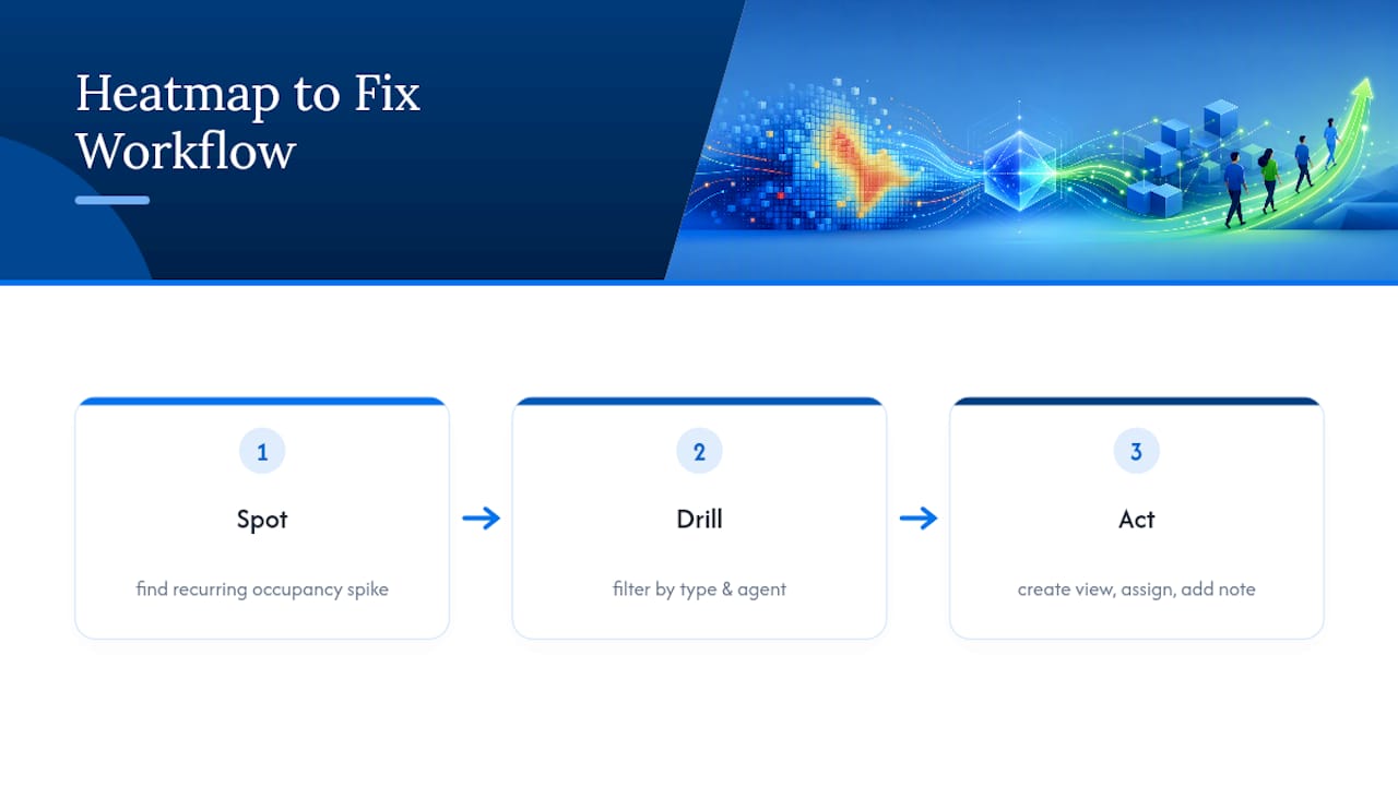
This is exactly where a shared inbox setup earns its keep. Auto-tags catch the ticket type before a human has to sort it, saved views group the hot queue instantly, and internal notes keep context attached to the ticket instead of buried in a side conversation. Managers using this workflow with a shared inbox tool typically shorten the gap between “the report flagged it” and “the fix is live” from days to hours.
Perspective: Measurement Mistakes Managers Make and How to Avoid Them
The biggest mistake isn’t a missing metric, it’s trusting an average. A team-wide occupancy average of 80% can hide one agent at 95% and another at 60%; look at distribution, not the mean. Measuring ticket count without AHT mistakes busyness for actual workload. And treating every skill group as interchangeable ignores that a billing question and a technical escalation are not the same unit of work. Replace each habit with one check: distribution over average, AHT-weighted volume over raw count, and skill-adjusted capacity over headcount.
— Nick
Close the Loop Faster With SendSync
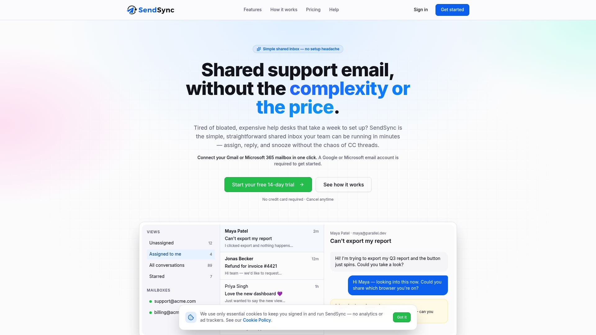
Sendsync is the alternative to a clunky help desk setup for teams who need report findings turned into fixes the same day, not after a DNS migration and a week of configuration. Connect your Gmail or Microsoft 365 mailbox in minutes, then use saved views to isolate the queue your heatmap just flagged, assign tickets to whoever has open capacity, and leave internal notes so the whole team sees why the reassignment happened.
If your workload report just showed a queue drowning at 10 a.m. every weekday, that’s the moment to act on it, not file it. Teams managing multiple inboxes benefit most from real-time visibility into where volume is landing before it becomes a backlog problem. For pricing details, visit the provider’s site to learn about available plans and user fees. Start a free trial at SendSync and connect your first inbox today.
Sources
- Workload Analysis in Call Centers — Finding Hidden Problems | HiveDesk
- Workload report
- Simpli
- How to Conduct a Workload Analysis: Methods and Template | Kickidler
FAQ
Can You Give Me an Example of a Workload?
A workload example is a support queue receiving many tickets during a peak window with an average handle time of several minutes, requiring a moderate number of agents at a typical occupancy level to clear it within SLA.
How Do We Measure Workload?
Workload is measured by combining ticket or call volume with handle time and available agent capacity, not by volume alone, since two tickets of different complexity consume very different amounts of time.
How Do You Do a Workload Analysis?
Pull at least four weeks of interval-level data across volume, AHT, occupancy, and QA scores, then check for peaks, team-level imbalance, and complexity by ticket type before deciding on staffing or process changes.
What Are Some Effective Tools for Managing Workload?
Ticketing platforms with built-in workload dashboards, workforce management software for scheduling, and a shared inbox like SendSync for routing and assigning tickets during a spike all serve different pieces of the workload puzzle.
How Often Should I Pull a Workload Report?
Check a weekly snapshot for immediate triggers, and review the 4-week trend at least biweekly to catch imbalance that a single week of data won’t reveal.