
4 Copyable Support Metrics Dashboard Templates for Support Teams
4 Copyable Support Metrics Dashboard Templates for Support Teams ! Analyst reviewing support metrics dashboard A support metrics dashboard is a live view of your team's ticket volume, response speed, resolution rate, and customer satisfaction, built to answer one question fast: i

A support metrics dashboard is a live view of your team’s ticket volume, response speed, resolution rate, and customer satisfaction, built to answer one question fast: is your queue healthy right now? Support managers and team leads use it to catch SLA risk early, spot backlog before it snowballs, and coach agents with real numbers. If you need templates and a build sequence, not just theory, keep reading.
TL;DR:
- Use median and p90 metrics for response and resolution times to account for skewed data and prevent outliers from distorting insights.
- Focus on outcome, operational, and diagnostic metrics with clear definitions, owners, and thresholds to ensure consistency and meaningful analysis.
- Build health-focused dashboards that include trend, backlog, SLA breach, and agent workload views, tailored to team size and ticket volume.
- Ensure data collection is consolidated into a modeled tickets table with accurate status history and standardized resolution criteria.
- Start with a small, outcome-driven dashboard for one key goal and run it for 30 days before expanding to other metrics or views.
Table of Contents
- Core Elements Every Support Metrics Dashboard Needs
- Which KPIs Should You Actually Track?
- Dashboard Templates You Can Copy This Week
- How to Build a Support Metrics Dashboard Step by Step
- Best Practices and the Mistakes That Undermine Trust
- How SendSync’s Shared Inbox Simplifies the Data Behind Your Dashboard
- What I’d Do First If I Ran This Team
- Get Your Support Data Dashboard Ready in Minutes, Not Weeks
- Templates and Guides Worth Bookmarking
- Sources
Core Elements Every Support Metrics Dashboard Needs
A working dashboard has layers. The top layer is a headline row your executive can read in ten seconds. Underneath that sits diagnostic detail your team leads actually use to fix problems.
A solid support overview dashboard leads with tickets created versus tickets solved, median first-response time, median resolution time, and CSAT. Below that headline row, build:
- Trend and load cards: weekly ticket volume, open backlog broken out by age (0 to 24 hours, 1 to 3 days, 3-plus days), and a p90 tail metric alongside the median.
- Diagnostic cards: performance sliced by channel, tag, and priority, so you can see whether billing tickets are slower than login issues.
- Agent views: individual workload and resolution patterns, framed for coaching rather than ranking.
- Data sources: a modeled tickets table, a status history table for accurate SLA timestamps, and a ratings table for CSAT.
Refresh cadence matters as much as the cards themselves. Real-time feeds suit a wall-mounted queue monitor; hourly or daily refreshes are plenty for a leadership scorecard.
Which KPIs Should You Actually Track?
Not every number deserves a spot on your dashboard. Split your metrics into three buckets: outcome metrics (CSAT, first contact resolution) that tell you whether customers are happy, operational metrics (first response time, resolution time, SLA compliance) that tell you whether your process is working, and diagnostic metrics (volume by channel, tag, agent) that tell you where to dig deeper.
Every metric needs a definition tight enough that two people pulling the same report get the same number. That means locking down the population (which tickets count), the clock (business hours or calendar time), the formula, and the exclusions (spam, duplicates, internal test tickets). Skip this step and “average resolution time” means something different in every meeting. This is the core discipline behind measuring the system instead of the story.
Time metrics in particular misbehave with averages. Support response times are heavily right-skewed. A handful of multi-day outliers can drag your “average” response time up by hours, even when most tickets get answered fast, which is why medians and p90 give a truer picture than a mean ever will.
| Metric | Best measure | Owner | Trigger action |
|---|---|---|---|
| First response time | Median + p90 | Team lead | p90 rising: rebalance queue |
| Resolution time | Median + p90 | Team lead | Median climbing: audit workflow |
| CSAT | Rolling average, segmented | Support manager | Drop below target: review flagged tickets |
| SLA compliance | Percentage of tickets in policy | Support manager | Below threshold: reassign staffing |
| Backlog age | Count by bucket | Team lead | 3-plus day bucket growing: escalate |
A practical KPI set built from ticket volume, response time, first contact resolution, resolution time, and agent workload covers most teams without overwhelming a scorecard.
Dashboard Templates You Can Copy This Week
Four templates cover almost every support team’s needs. Each one answers a different question, so don’t try to cram them into one screen.
- Support overview (exec roll-up): tickets created vs. solved, median FRT, median resolution, CSAT, and a backlog trend line. This is the one leadership actually opens.
- SLA and response monitor: real-time queue status, tickets approaching breach, and alerts pushed to Slack or Teams. Geckoboard’s live wallboard examples show how queue health and breach warnings work as a shared, always-on screen.
- CSAT dashboard: satisfaction scores segmented by channel, agent, and ticket type, with response rate shown alongside the score. A 12% survey response rate reads very differently from a 60% one, even at the same average score.
- Agent performance view: median handle time, ticket volume distribution, and resolution rate per agent, built for one-on-ones rather than leaderboards.
B2B teams with lower volume can lean harder on per-ticket detail; B2C teams with thousands of daily tickets need tighter aggregation and heavier reliance on percentiles to avoid noisy charts.
How to Build a Support Metrics Dashboard Step by Step
Building the dashboard is mostly data plumbing, not chart design. Get the plumbing right first.
- Sync your help desk data into a clean tickets table. Pull ticket ID, created timestamp, status changes, channel, tag, priority, and assigned agent. If you run more than one support tool, consolidate them into one modeled layer so cards don’t fragment by source.
- Define “resolved” once, in writing. Decide whether your clock runs on business hours or calendar time, and whether it stops at first resolution or final closure. Write it down where every stakeholder can see it.
- Build a status history table, not just a resolved timestamp. Without it, SLA accuracy suffers, and any breach card should carry a caveat until the history table exists, a point Atlassian’s community guidance makes directly.
- Model medians and p90, not averages, for every time metric. Skewed data punishes anyone who trusts a mean.
- Add filters for channel, tag, and team, then walk each card past the people who own that metric before it goes live.
- Set your refresh cadence deliberately. Real-time for wallboards, hourly or daily for the exec scorecard nobody’s staring at all day.
Pro Tip: Build the diagnostic view before the exec view. If your tags and clocks are wrong, you’ll catch it fixing agent-level detail long before a leadership scorecard would ever expose the mistake.
If your team is still spreadsheet-based, tools built for operational dashboard design or a structured analytics checklist for spreadsheet teams can get you most of the way there without a BI platform.
Best Practices and the Mistakes That Undermine Trust
Treat a dashboard as a shared guidepost, not a surveillance camera aimed at your agents. Metrics without context turn into blame, and agents who feel watched start gaming the numbers instead of fixing the underlying problem.
A leadership scorecard works best with 6 to 10 well-chosen measures, each tied to an owner, a threshold, and a specific action. Frontline diagnostic views can carry more detail, but the same rule applies: no metric without an owner.
- Mixing business-hours and calendar-time clocks on the same chart without labeling which is which.
- Reporting average resolution time instead of median and p90 for a right-skewed distribution.
- Dumping ten unlabeled numbers on a wallboard with no threshold or owner attached to any of them.
- Ranking agents publicly by raw ticket count instead of using performance data for private coaching.
How SendSync’s Shared Inbox Simplifies the Data Behind Your Dashboard
Most dashboard headaches start before the first chart gets built. They start with fragmented data: tickets scattered across three inboxes, no shared history, no single definition of “resolved.” A shared inbox built for support teams sidesteps a lot of that by keeping every conversation in one modeled place from day one.
- Gmail and Microsoft 365 connect directly, so there’s no DNS setup delaying your data pipeline.
- One inbox means one clock, one status history, and one definition of resolved across your whole team.
- Real-time visibility into shared conversations makes response-time and backlog metrics accurate from the start rather than reconstructed after the fact.
- Unlimited seats mean your dashboard reflects your whole team, not just the agents whose logins made it into the budget.
What I’d Do First If I Ran This Team
Pick one outcome you’re actually trying to protect this month, whether that’s response time or CSAT, and build the smallest dashboard that shows it honestly. Add one coaching view for your team leads. Run it for 30 days before you touch anything else.
Report early wins in plain numbers, not vague progress language. “Median first response dropped from 6 hours to 3.5” convinces a stakeholder. “Things are improving” does not. Momentum comes from one clean win, reported clearly, not from a dashboard with 40 metrics nobody trusts.
— Nick
Get Your Support Data Dashboard Ready in Minutes, Not Weeks
Choosing a modern shared inbox solution can speed access to clean support data by connecting your existing Gmail or Microsoft 365 mailbox quickly and starting work from one shared, modeled inbox immediately.
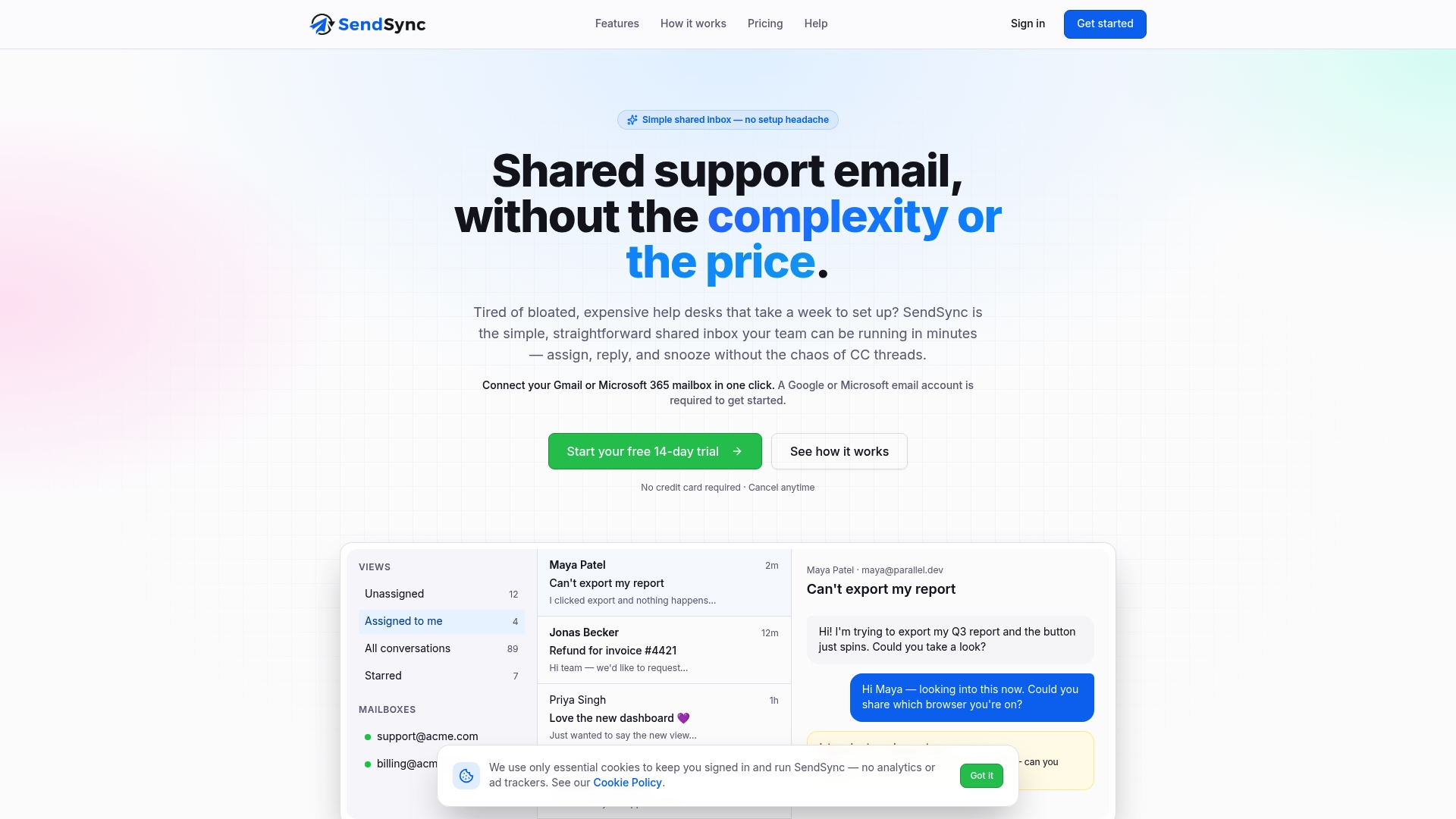
That speed matters because every template in this guide, from the overview scorecard to the SLA monitor, depends on clean ticket data with one clock and one definition of resolved. A suitable shared inbox solution can provide that from day one, often offering unlimited users without per-seat fees as your team grows. There’s a 14-day trial with no setup marathon attached. Head to Sendsync and connect your inbox today to see how fast your dashboard data gets clean.
Templates and Guides Worth Bookmarking
For deeper reference beyond this guide:
- Metabase’s support overview template for headline card layouts and modeling advice.
- Geckoboard’s customer service dashboard examples for live wallboard design and alerting patterns.
- Simpli for governance rules and precise metric definitions.
Sources
- Customer Support Overview dashboard (Metabase)
- Live customer service dashboards for your whole support team | Geckoboard
- Simpli